原文来自微信公众号:Vue 中文社区
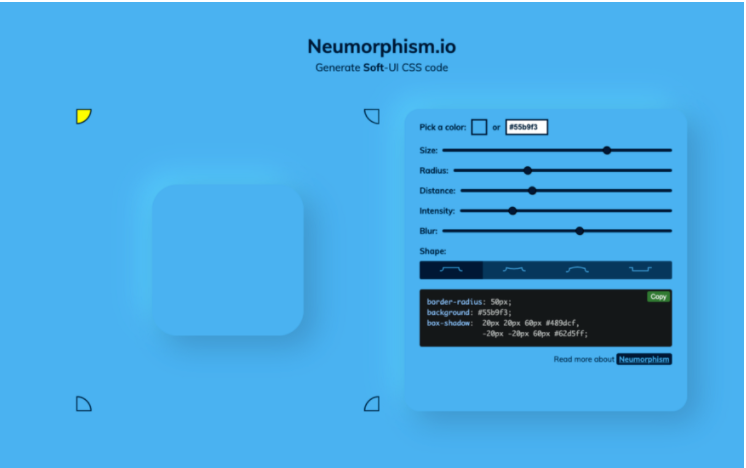
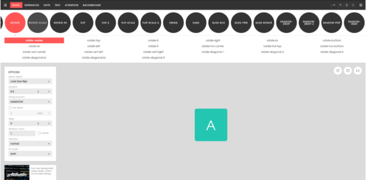
Neumorphism
地址:https://neumorphism.io/
它创造了一种全新的 UI 风格。来自世界各地的设计师已经在 Dribbble 和 Behance 上看到了引人注目的中性设计。
但是这个工具,可以直接在线调试 UI 风格,并直接生成 CSS 代码

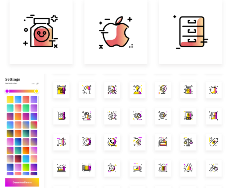
带有渐变的图标
地址:https://www.iconshock.com/svg-icons/
在设计的时候,我们都注重简约。不过,有时我们喜欢添加一些渐变效果,这样会显得图标层次更加丰富一些,而这个工具,就可以帮助我们提升工作效率,哪怕你没有设计能力,你也可以设计出漂亮的图标。
而这些精美的图标和大量渐变可为你提供创作灵感。
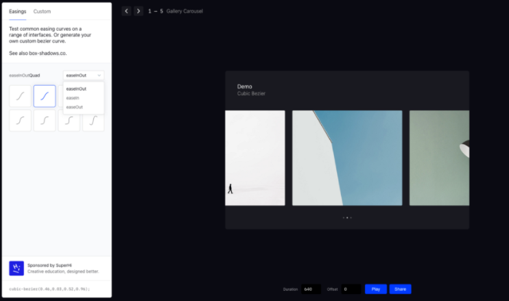
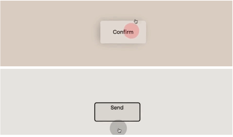
Interactions
地址:https://easings.co/
在一系列界面上测试常见的缓动曲线。或生成自己的自定义贝塞尔曲线
没有比这更顺畅的交互和动画效果了。
我经常与开发人员合作,向他发送在此生成器中设置的交互。这将使你的数字产品保持美观和正常工作。
在这里您可以计算出交互作用,例如:
使用方法
1
2
3
4
5
6
7
8
9
10
11
12
13
14
15
16
17
18
19
20
21
22
23
24
25
| <!DOCTYPE html>
<html>
<head>
<meta charset="utf-8" />
<title>菜鸟教程(runoob.com)</title>
<style>
div {
width: 100px;
height: 100px;
background: red;
transition: width 0.5s;
transition-timing-function: cubic-bezier(0.22, 0.61, 0.36, 1);
}
div:hover {
width: 300px;
}
</style>
</head>
<body>
<h1>cubic-bezier() 函数</h1>
<p>鼠标移动到 div 元素上,查看效果。</p>
<div></div>
</body>
</html>
|
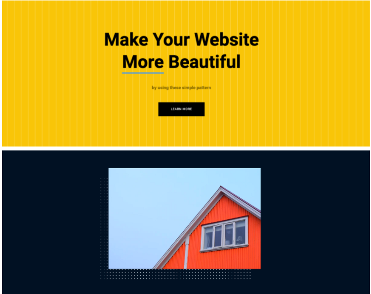
大型数据库
地址:https://bansal.io/pattern-css
仅用 CSS 库就可以完成美丽图案填充空背景效果。
在此页面上,你可以为你的数字产品制定理想的背景。你也可以将其用作物品和照片的装饰。
样式截图效果如下:
自定义形状分隔线
地址:https://www.shapedivider.app/
划分布局和形状已经变得非常时尚。使用此工具,你可以创建可响应的波形和自定义形状分隔线。
动画
地址:https://animista.net/
庞大的动画库。在这里,你将找到可用于组件,照片和文本的基本,以及更高级的动画
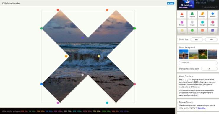
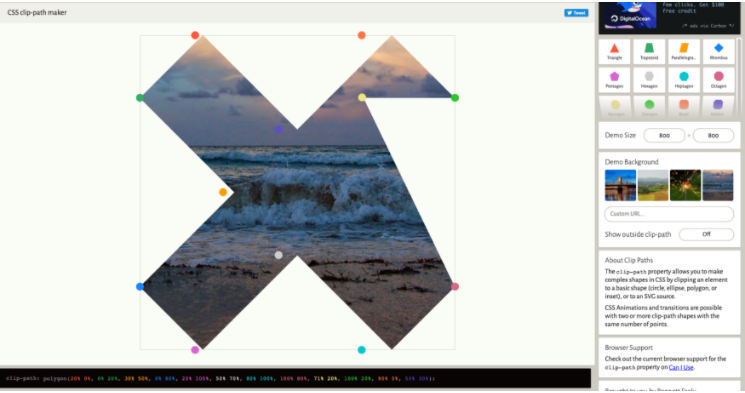
Mask
地址: https://www.html.cn/tool/css-clip-path/
clip-path 属性允许你通过将元素裁剪为基本形状(圆形,椭圆形,多边形或插图)或 SVG 源来在 CSS 中制作复杂的形状。
CSS 动画和过渡可以使用两个或多个具有相同点数的剪切路径形状。
动画按钮
地址:https://tympanus.net/Development/MagneticButtons/index.html
有一些有趣的悬停动画的磁性按钮。
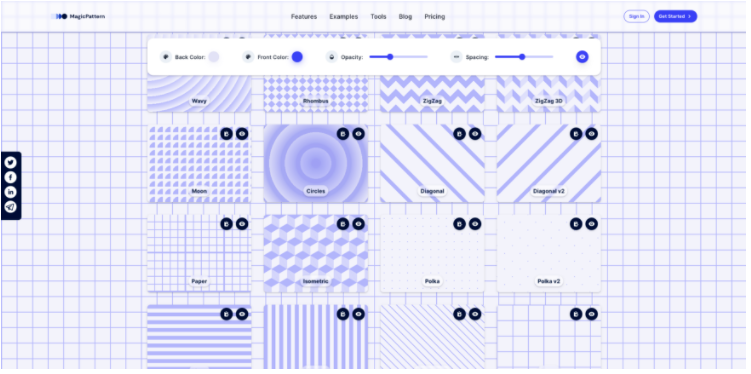
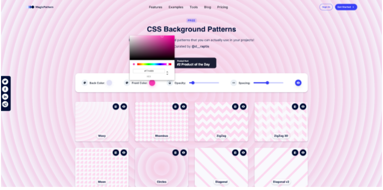
背景图案
地址:https://www.magicpattern.design/tools/css-backgrounds
你可以在项目中使用漂亮的纯 CSS 背景图案。
在创造页面上,你可以找到非常不同的码型生成器。但是,请记住,其中一些需要高级套餐
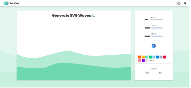
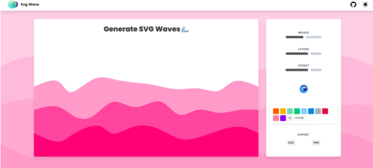
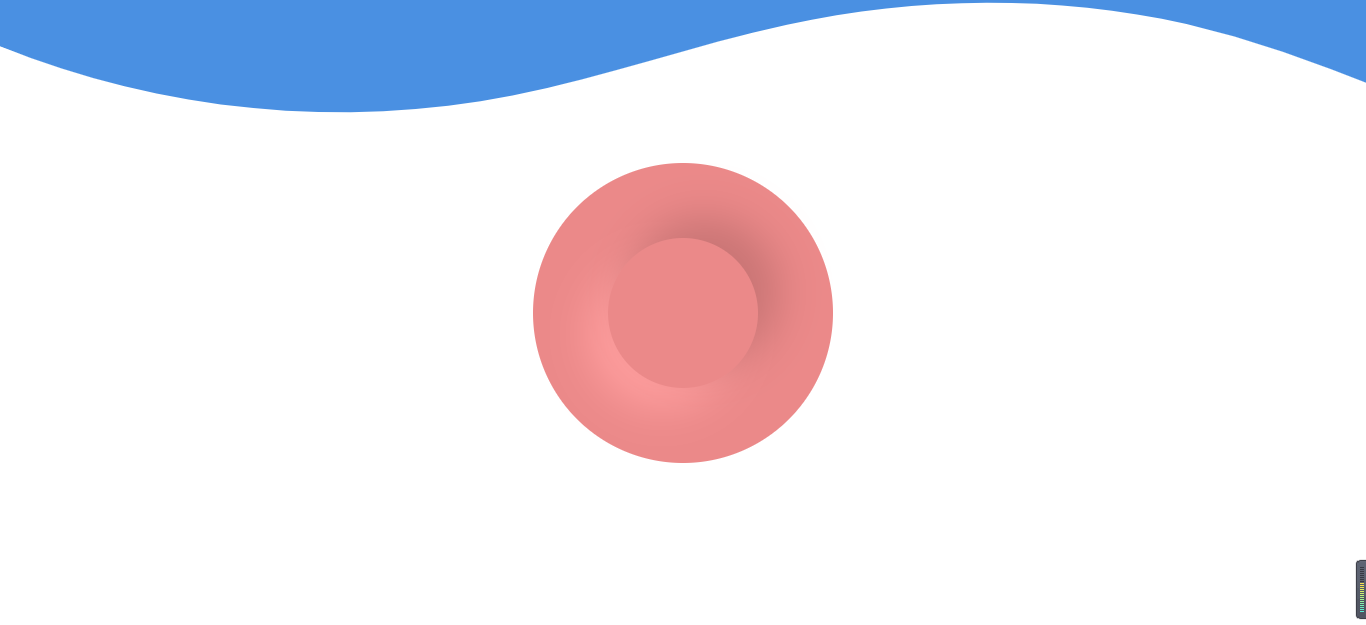
SVG 波浪
地址:https://svgwave.in/
最后一个工具是波浪效果生成器。它使用简单,可以制作多个图层并对其进行修改
案例代码
1
2
3
4
5
6
7
8
9
10
11
12
13
14
15
16
17
18
19
20
21
22
23
24
25
26
27
28
29
30
31
32
33
34
35
36
37
38
39
40
41
42
43
44
45
46
47
48
49
50
51
52
53
54
55
56
57
58
59
60
61
62
63
64
65
66
67
68
69
70
71
72
73
74
75
76
77
78
79
80
81
82
83
84
85
86
87
88
89
| <!DOCTYPE html>
<html lang="en">
<head>
<meta charset="UTF-8" />
<meta http-equiv="X-UA-Compatible" content="IE=edge" />
<meta name="viewport" content="width=device-width, initial-scale=1.0" />
<title>Document</title>
</head>
<style>
.custom-shape-divider-top-1620695331 {
position: absolute;
top: 0;
left: 0;
width: 100%;
overflow: hidden;
line-height: 0;
}
.custom-shape-divider-top-1620695331 svg {
position: relative;
display: block;
width: calc(140% + 1.3px);
height: 203px;
}
.custom-shape-divider-top-1620695331 .shape-fill {
fill: #4a90e2;
}
* {
margin: 0px;
padding: 0px;
}
.newbody {
width: 100%;
height: 100vh;
display: flex;
flex-direction: column;
justify-content: center;
align-items: center;
}
.neumber {
width: 300px;
height: 300px;
display: flex;
justify-content: center;
align-items: center;
background: #eb8989;
border-radius: 50%;
}
.neumber div {
width: 150px;
height: 150px;
border-radius: 50%;
box-shadow: 21px -21px 42px #c87474, -21px 21px 42px #ff9e9e;
transition: 0.3s;
transition-timing-function: cubic-bezier(0.85, -0.67, 0.16, 1.66);
}
.neumber div:hover {
width: 200px;
height: 200px;
}
</style>
<body>
<div class="custom-shape-divider-top-1620695331">
<svg
data-name="Layer 1"
xmlns="http://www.w3.org/2000/svg"
viewBox="0 0 1200 120"
preserveAspectRatio="none"
>
<path
d="M321.39,56.44c58-10.79,114.16-30.13,172-41.86,82.39-16.72,168.19-17.73,250.45-.39C823.78,31,906.67,72,985.66,92.83c70.05,18.48,146.53,26.09,214.34,3V0H0V27.35A600.21,600.21,0,0,0,321.39,56.44Z"
class="shape-fill"
></path>
</svg>
</div>
<div class="newbody">
<div class="neumber">
<div></div>
</div>
</div>
</body>
</html>
|